


As some of you might know, I have been working on the UI for Gemini in Android Studio — née Studio Bot. This has exposed me quite a bit to the other Gemini branded products, the main of which is the website:
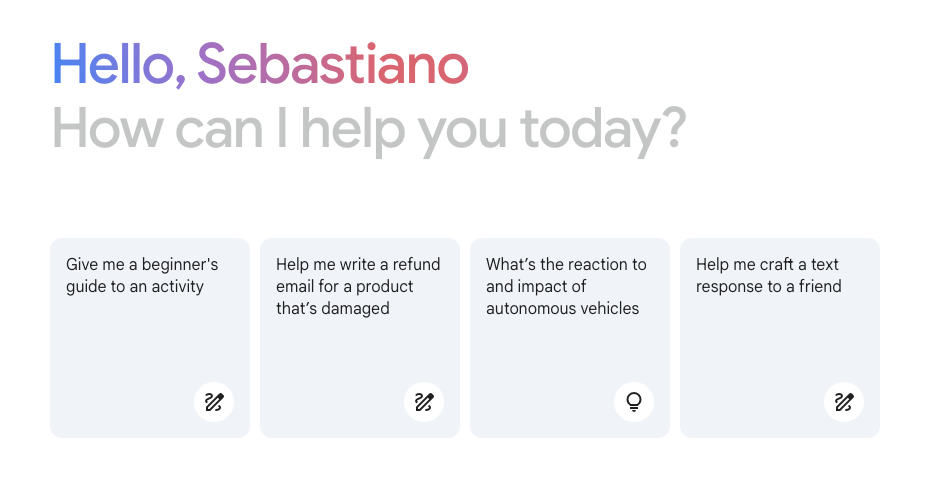
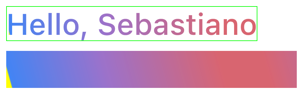
I really like its appearance, and particularly, I really enjoy the animation that the greeting text plays when you open the page:

And I thought:
How is this made? Can I implement this in Compose for Desktop?
The answer is — perhaps unsurprisingly — yes! But implementing this was trickier than I expected...
Step 1: understanding the animation
Let's start by trying to figure out what's going on in this animation. The second line is a trivial alpha animation, so we will not be spending time on that. The first line, however, is more complex. It looks like the text is being revealed with a horizontal wipe, and its fill is an animated gradient that seems to move from left to right at the same time.
But what is going on here, really? Let's open the Chrome inspector and see...
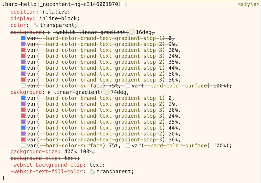
At first glance, we can only see a gradient (with some odd stops), and a couple other attributes. No animation! We'll have to figure that out in another way. Let's first focus on understanding the gradient.

It's a linear gradient, oriented at 74 degrees. CSS angles start from vertical and proceed clockwise, so 74 degrees is what we'd think as -16 degrees in Compose, where angles start from horizontal and proceed clockwise.
The gradient has 10 stops, using three brand colours (#4285F4, #9B72CB, and #D96570) followed by white:

Notably, the last 25% is all white. And the page background is white. And the background-size is set to 400% on the x axis. Too many things lining up for this to be a coincidence! Oh, and the text colour is transparent, and its background is clipped to the text itself! Is this related to the animation?
Let's look at how that works. It's tricky to see it in action in the dev tools because it only lasts a second or so when the page loads. But we can use the CSS class bard-hello to search for something that looks like an animation spec!
The HTML page itself has nothing useful, and I suspect JS may trigger this animation when the page loads. Going to the Sources tab, we can see a number of files in the tree on the left. Given my intuition this is probably done in JavaScript, I went searching for js files, and eventually ran into this hit:
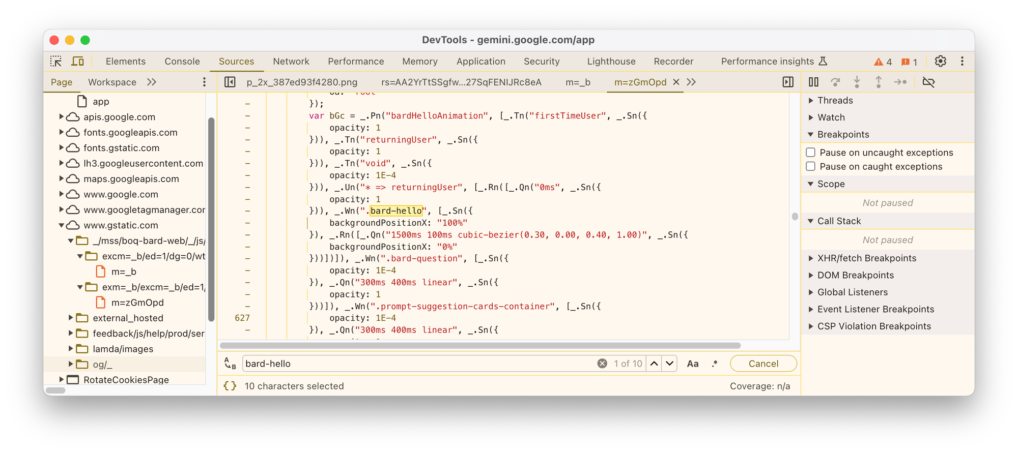
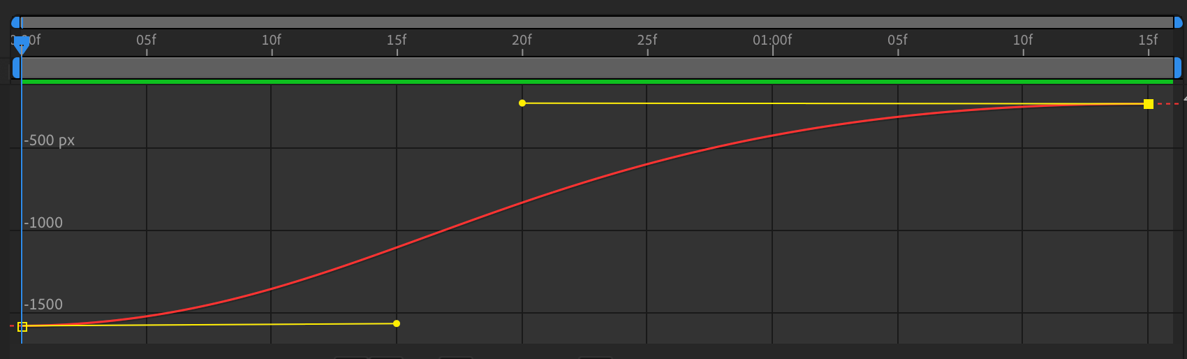
This is promising! I can see both a property that seems relevant, backgroundPositionX, and what looks like a CSS animation spec, 1500ms 100ms cubic-bezier(0.30, 0.00, 0.40, 1.00). The rest of the code is obfuscated, but this is enough information for me to assume the code is actually animating the backgroundPositionX using this spec:
- Duration is 1500 ms
- Start delay is 100 ms
- Interpolation is a cubic Bézier curve using the points
(0.3, 0.0), (0.4, 1.0)
What are the values being animated from and to? It's not very clear, but I think we can assume it's either going from 0% to 100%, or the other way around, given those values are found next to the backgroundPositionX property.
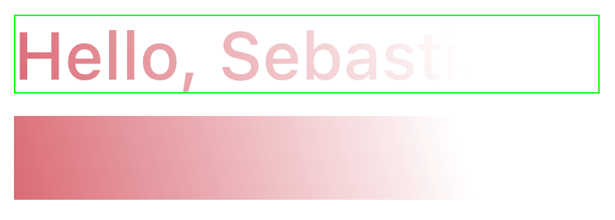
Ok, we have enough information now to see that they're not two separate animations, but rather, one cleverly arranged gradient animation that handles both the text appearance and its colourful accents! At the start, the gradient — which is 4x wider than the text — is positioned so that the text sits on the white quarter of the gradient. This way, it's essentially invisible, given the background is white:

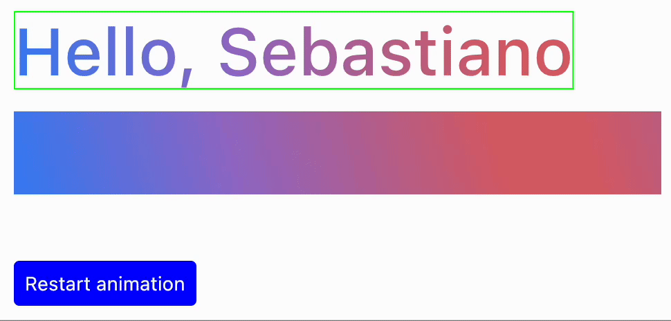
Then, at the end of the animation, the gradient is moved so that the text is fully covered by the left-hand quarter, being colourful and fully visible:

Tying it all together is the animation. The interpolation curve looks something like this:
And when we play it, we get the same effect as on the webpage:

Step 2: implementing it in Compose
Now that we understand how the animation is implemented on the web, we need to figure out what's the equivalent implementation in Compose. In particular, we'll use Compose for Desktop, but a similar approach would also work on Android.
Gradient text
Compose offers, since version 1.2, the ability to use a Brush in a TextStyle. The wonderful Alejandra Stamato has a great article on the topic that I recommend you read before proceeding:
 Alejandra Stamato
The tl;dr is that, by using a Brush, we unlock a number of fancy possibilities, including using gradients for drawing text. Our gradient is at an angle, so we need to use a Brush.linearGradient() instead of a Brush.horizontalGradient().
First of all, we need to define our colours and their stops, based on the CSS gradient:
// Define the colours
private val brandColor1 = Color(0xFF4285F4)
private val brandColor2 = Color(0xFF9B72CB)
private val brandColor3 = Color(0xFFD96570)

private val colors = listOf(
    brandColor1,
    brandColor2,
    brandColor3,
    brandColor3,
    brandColor2,
    brandColor1,
    brandColor2,
    brandColor3,
    Color.White,
    Color.White
)

private val stops =
    listOf(0f, .09f, .2f, .24f, .35f, .44f, .5f, .56f, .75f, 1f)

private val colorStops = arrayOf(
    stops[0] to colors[0],
    stops[1] to colors[1],
    stops[2] to colors[2],
    stops[3] to colors[3],
    stops[4] to colors[4],
    stops[5] to colors[5],
    stops[6] to colors[6],
    stops[7] to colors[7],
    stops[8] to colors[8],
    stops[9] to colors[9],
)
Then, it's time to construct the Brush itself. I am using some basic trigonometry to angle it by -16 degrees. We don't need anything from the Material or Jewel themes, so to keep it simple, we'll use the BasicText composable to draw the text, for now. Creating our ShaderBrush allows us to build the underlying Shader directly, while having access to the size of the area to paint:
val brush = remember {
    object : ShaderBrush() {
        override fun createShader(size: Size): Shader {
            val gradientWidth = size.width * gradientXScale
            val startX = gradientWidth * gradientOffset.value
            val endX = startX + gradientWidth
            return LinearGradientShader(
                from = Offset(startX, 0f),
                to = Offset(endX, gradientWidth * sin(gradientAngleRadians)),
                colors = colors,
                colorStops = stops,
            )
        }
    }
}

BasicText(text, modifier, style.copy(brush = brush))
To make sure everything looked good, I also used the brush to draw a rectangle around the text. The gradient seems ok:
Animations!
Before we get into the motion part, you should know that Alejandra has an article on text gradient animations, too. You should read it to make sure you have the basics, as I am jumping straight into the action, next:
Alejandra Stamato
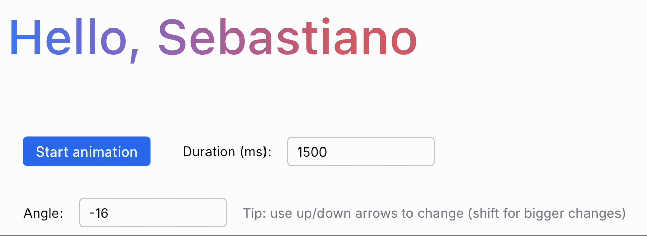
In our case, we can animate the gradient by creating an offset float that goes from -1 to 0, and applying that as an offset to startX and endX. We use an Animatable, since we need to control and reuse the animation. When the user clicks a button, we (re)start the animation:
val gradientAnimatable = remember { Animatable(-1f) }

AnimatedGradientText(
  "Hello, Sebastiano",
  gradientAnimatable,
  gradientAngle = rawAngle.toDouble(),
  modifier = Modifier.weight(1f),
)

val isAnimating = remember { mutableStateOf(false) }
Row(
  modifier = Modifier.padding(horizontal = 16.dp),
  horizontalArrangement = Arrangement.spacedBy(16.dp),
  verticalAlignment = Alignment.CenterVertically
) {
  var animationDurationMillis by remember { mutableIntStateOf(1500) }
  val scope = rememberCoroutineScope()

  // Start the animation when entering the composition
  LaunchedEffect(Unit) {
    scope.doAnimationAsync(isAnimating, gradientAnimatable, animationDurationMillis)
  }

  DefaultButton(onClick = {
    scope.doAnimationAsync(isAnimating, gradientAnimatable, animationDurationMillis)
  }, enabled = !isAnimating.value) {
    BasicText("Start animation", style = TextStyle.Default.copy(Color.White))
  }

  // ...
}
The animation control code is pretty straightforward:
private fun CoroutineScope.doAnimationAsync(
  isAnimating: MutableState<Boolean>,
  gradientAnimatable: Animatable<Float, AnimationVector1D>,
  animationDurationMillis: Int
) {
  launch {
    isAnimating.value = true
    doAnimation(gradientAnimatable, animationDurationMillis)
    isAnimating.value = false
  }
}

private suspend fun doAnimation(animatable: Animatable<Float, AnimationVector1D>, durationMillis: Int) {
  println("Starting animation (${durationMillis} ms)")
  animatable.stop()
  animatable.snapTo(-1f)
  animatable.animateTo(
    targetValue = 0f,
    animationSpec = tween(
      durationMillis = durationMillis,
      easing = CubicBezierEasing(0.3f, 0f, 0.4f, 1f),
    )
  )
  println("Done animating")
}
Let's run the new code...
This looks great! Time to celebrate 🎉
...and if I were not the pixel peeper that I am, this would be the end of this article. However, given that I have forgotten most of my high school trigonometry, and I know better than trusting myself with maths, I was not fully convinced that I was creating the brush correctly. I decided to validate that what I was doing was not just a "happens to look good in this one case" solution.
Ooooh, boy. Strap in.
Step 3: how deep is the rabbit hole?
Wanting to validate my code, I tweaked the gradient stops to add a thin strip of yellow at the start, and green at the end. Since the gradient brush clamps the gradient by default, this means all pixels "before" the start and "after" the end would all get these debug colours, making it easier to see what's going on:

Armed with my not-so-fancy debug tools, I started the code again, and I could already see that something was off:
I shouldn't ever see yellow or green! The gradient on the web covers all the text — I tried adding yellow and green in with the Chrome dev tools, and it looks just as lovely as ever. There's only one explanation: I done goofed.
Changing the gradient angle only showed things getting worse. My code was sort of working because the angle was small enough, but the closer to a vertical gradient it became, the worse it got. This does NOT look like it's -90 degrees:
If I set the web gradient to the equivalent angle of 0 degrees, it looks like this, which is what I would expect:

What are we doing wrong?
Intermission: CSS linear-gradient
To understand what's going on, we need to go back to that CSS gradient from the beginning of the article:
background: linear-gradient(
  74deg,
  var(--bard-color-brand-text-gradient-stop-1) 0,
  var(--bard-color-brand-text-gradient-stop-2) 9%,
  var(--bard-color-brand-text-gradient-stop-3) 20%,
  var(--bard-color-brand-text-gradient-stop-3) 24%,
  var(--bard-color-brand-text-gradient-stop-2) 35%,
  var(--bard-color-brand-text-gradient-stop-1) 44%,
  var(--bard-color-brand-text-gradient-stop-2) 50%,
  var(--bard-color-brand-text-gradient-stop-3) 56%,
  var(--bard-color-surface) 75%,
  var(--bard-color-surface) 100%
)
It turns out that there is an important aspect this declaration does not include: what are the start and end points for the gradient? Well, it turns out the CSS specs cover it — they're fixed points, calculated based on the bounds of the HTML element, and the angle.
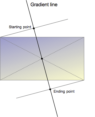
Reading the specs, we now learn how the starting and ending points are actually defined:
The starting point is the location on the gradient line where the first color begins. The ending point is the point where the last color ends. Each of these two points is defined by the intersection of the gradient line with a perpendicular line passing from the box corner which is in the same quadrant. The ending point can be understood as the symmetrical point of the starting point.
Great! This is not hard to understand, especially when looking at that graph. I guess we need to adopt the same logic in our code to calculate these points instead of the entirely arbitrary way I had picked before. How hard could it be?
Turns out I forgot how trigonometry works
Ok, I will be upfront with y'all — this next section actually took way more time to figure out than I thought. Why? Well, because, as the title says, it turns out I forgot most of my high school trigonometry. I went down several dead ends, wrote several diagrams on paper to help me figure this out, and finally caved in to the fact I would have to re-learn what a cotangent was.
Now, you may say, how hard can this be? It's just calculating the projection of a point on a line! And I am sure there are people out there who do it all the time, but I did not remember a single thing about this. I even had to look up the basic equation for a line, which now I am very glad to tell you is y = m * x + b, where m is the gradient of the line, and b is the x value at which the line crosses the horizontal axis.
🚑 Quick geometry and trigonometry recap
If you, like me, don't remember any of this stuff, here are a few important things to brush off to understand what comes next.
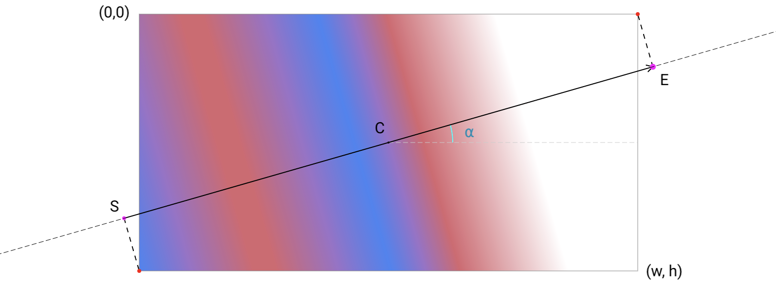
As I mentioned, a line can be expressed as y = m * x + b, and you can calculate a line's equation coefficients when you have either two points it goes through, or a point and an angle. We're in the latter situation — we know the gradient line goes through the centre and has a certain angle.
We can then calculate the m value as the tangent of the angle: m = tan(angle). Then, solving for the b intersect, we get b = y - m * x.
Another important thing to know is the m value for a perpendicular line is defined as m_perp = -1 / m. This is useful because the projection of a point on a line lies on a perpendicular line that goes through that same point.
This is enough for what we need, but it's only scratching the surface. I guess I'll have to re-learn a lot more of this stuff as I go on...
Recapping, to calculate the start and end points to use, we need to:
- Calculate the equation of the gradient line
- Determine which corners are the closest to the line when it crosses the horizontal edges of the canvas bounds
- Calculate the projection of those corners onto the gradient line
Let's start with something easy: which corners should we use as reference?
// Calculate the angle in radians
val angleRadians = Math.toRadians(angleDegrees)

// Determine the closest corners to the intersection points
val normalizedAngle = (angleDegrees + 180) % 360.0
val (startCorner, endCorner) = when {
  normalizedAngle < 90.0 ->
      Offset(size.width, size.height) to Offset(0f, 0f)
  normalizedAngle < 180.0 ->
      Offset(0f, size.height) to Offset(size.width, 0f)
  normalizedAngle < 270.0 ->
      Offset(0f, 0f) to Offset(size.width, size.height)
  else ->
      Offset(size.width, 0f) to Offset(0f, size.height)
}x, by using 0 and size.height as the y values, and seeing whether it's to the left or right of the center.x. Even more, we can only do it for
y = 0, since we know the bottom corner to use is always on the other side of the one we pick at the top edge. I haven't done it because there isn't much performance gain, and it results in slightly less well-organised code. However, it would conceptually be easier to follow.The first point is about calculating the gradient line, and the third point essentially means computing the equation of a line that is perpendicular to the gradient line and goes through either corner. I would be lying if I said I got here at the first — or tenth — try, though. I will spare you the hours of bad attempts and frustration I went through. Think of this section as a hero training montage!
At first, I was looking for an easy way out and tried using both a few LLMs, and some random web searches, to do the work for me. It turned out I didn't even know what to look for exactly, so I didn't come up with anything useful. I had to sit down with pen and paper, search for things the old-fashioned way on Google and StackOverflow, and only then I had enough understanding of the problem to even start being able to solve it. Eventually, I managed to get a pointer to solve the last issue I had by asking Gemini 1.5 Pro. Thanks Gemini; funny you should be the key to solving this 😁
In itself, the actual code to calculate the projection is not complex:
private fun calculateProjection(
    linePoint: Offset,
    angleRadians: Double,
    pointToProject: Offset
): Offset {
  // Calculate slope from angle
  val m = tan(angleRadians)

  // Calculate y-intercept (b) using the point-slope form
  val b = linePoint.y - m * linePoint.x

  // Slope of the perpendicular line
  val mPerpendicular = -1.0 / m

  // Equation of the perpendicular line passing through pointToProject
  // y - y1 = m_perp (x - x1)
  // y = m_perp * (x - x1) + y1

  // Solve for intersection point (xp, yp)
  val xp = (b - pointToProject.x / m - pointToProject.y) / (mPerpendicular - m)
  val yp = m * xp + b

  return Offset(xp.toFloat(), yp.toFloat())
}
With a lot of swearing, and some debug drawing, we get to something that looks like this:
Excellent! This actually looks like what we were going for. However, I remember from high school that the tan function goes all funny when you have a vertical gradient line, so I decided to special-case the vertical and horizontal gradients, taking advantage of the fact that we have specialised horizontalGradient and verticalGradient shaders and brushes:
val normalizedAngle = angleDegrees % 360.0

// Handle base cases (vertical and horizontal gradient) separately
return when {
  abs(normalizedAngle % 180.0) < angleEpsilon -> {
    val leftToRight = abs(normalizedAngle) < 90.0
    createHorizontalGradient(size, leftToRight, offset)
  }
  abs(abs(normalizedAngle) - 90.0) < angleEpsilon -> {
    val startsFromTop = normalizedAngle >= 0.0
    createVerticalGradient(size, startsFromTop, offset)
  }
  else -> createLinearGradient(size, normalizedAngle, offset)
}
I'll omit the horizontal and vertical gradient implementations because they're fairly simple, and this post is already long enough. You can find the entire code in the repo:
 rock3r
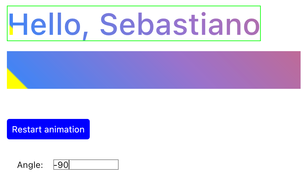
And now, for the grand finale, here's our 100% Compose for Desktop implementation of the Gemini web greeting animation:
Do you want to implement a similar animation or need to emulate a CSS gradient? You can find CssGradientBrush in the repository.
One more thing: performance
Before I let you go, one note on the performances of this implementation. Right now, as of Compose for Desktop 1.6.x, making this animate requires a recomposition on every frame, since the way the shader that underpins the Brush is not re-created when snapshot-backed data used to initialise it changes. This is not the end of the world, especially on desktop, but ideally, we should be able to only affect the draw phase, saving us some unnecessary recomposition.
For now, we need to key the Brush creation with all the snapshot-backed values and function parameters that can change:
val brush = remember(
    gradientXScale,
    gradientOffset.value,
    gradientAngle,
    gradientColors,
    gradientStops,
) {
    CssGradientBrush(
        angleDegrees = gradientAngle,
        colors = gradientColors,
        stops = gradientStops,
        scaleX = gradientXScale,
        offset = Offset(gradientOffset.value, 0f),
    )
}
This is not an issue in Jetpack Compose as of last fall. However, the fix is only getting to us on the Desktop side in the 1.7 timeframe — which is hopefully happening soon, or maybe has already landed, depending on when you read this.
If you're curious, there are more details on this issue: https://github.com/JetBrains/compose-multiplatform/issues/4903
Ok, that's all. Go play with some gradients!
Thanks to Halil Özercan, Mark Allison, Romain Guy, Daniele Bonaldo, Aurelio Laudiero, Erik Hellman, and Jozef Celuch for their suggestions and proofreading ❤️