
Everyone knows that Material Design has shadows. Most know that you can control the virtual Z coordinate of Material elements in Android by using the elevation property, to control the shadow. Very few know that there’s so much more you can do to tweak the shadows your UI elements cast!
Update 6th Nov 2018: I just published a follow-up to this article with new APIs added in P, and a bunch of other goodies. Do check it out!

What is that shadow all about
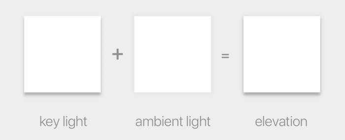
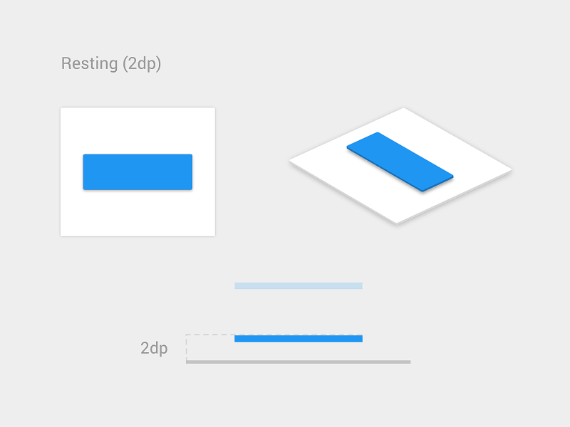
In Material Design, the elevation is a manifestation of the virtual Z coordinate of a material plane relative to the screen’s “base” plane. For example:
In the Material Design system, there are two light sources. One is a key light that sits above the top of the screen, and an ambient light that sits directly above the centre of the screen:
These two lights cast each their own shadow, one which is mostly affecting the bottom edge of a material sheet (key light), and the other which is affecting all edges (ambient light):
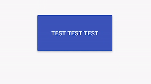
The elevation property directly controls the shape of the resulting shadow; you can see this clearly with buttons, which change their elevation based on their state:
You may think that the elevation property is the only way to control how shadows look, but that’s not true.
In Android, there is a very little known API called Outline that is providing the required information for a Material sheet to project a shadow. The default behaviour for Views is to delegate the outline definition to their background drawable. ShapeDrawables for example provide outlines that match their shapes, while ColorDrawables, BitmapDrawables, etc. provide a rectangle matching their bounds. But nothing says we cannot change that, and tell a view to use a different ViewOutlineProvider, using the setOutlineProvider() method:
view.outlineProvider = outlineProviderIf we control the ViewOutlineProvider, we can tweak the resulting Outline, tricking the OS into drawing whatever shadow we want:
inner class OutlineProvider(
private val rect: Rect = Rect(),
var scaleX: Float,
var scaleY: Float,
var yShift: Int
) : ViewOutlineProvider() {
override fun getOutline(view: View?, outline: Outline?) {
view?.background?.copyBounds(rect)
rect.scale(scaleX, scaleY)
rect.offset(0, yShift)
val cornerRadius =
resources.getDimensionPixelSize(R.dimen.control_corner_material).toFloat()
outline?.setRoundRect(rect, cornerRadius)
}
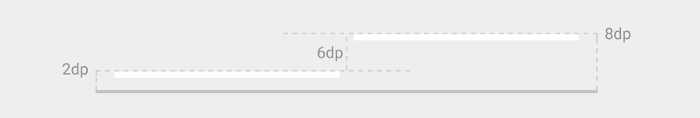
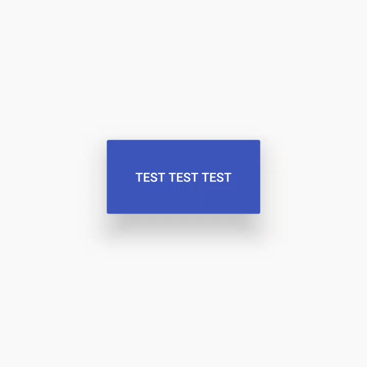
}You can use elevation and Outline to do all sorts of tweaks to the shape and position of an elevation shadow:
You will notice how the shadow here does not just adapt to different elevation values, but is also translated around and gets a larger or smaller size than the view itself.
Another thing you can do is to assign a shape that is different from the actual outline of the view itself — I cannot think of any situation in which this would make sense, but you could. The only limitation is that the shape must be convex. There are convenience methods on Outline to have ellipses, rectangles and rounded rectangles, but you could also use any arbitrary Path, as long as it’s convex.
Unfortunately it’s not possible to exaggerate some effects too much, since as you can see there are some shortcuts the system takes when rendering the shadows which will create some rather annoying artefacts when you hit them.
In case you are curious how shadows are rendered in Android, the relevant code is in thehwuipackage in AOSP — you can start looking atAmbientShadow.cpp(note: starting with Android 10, hwui is not really used anymore, and everything is rendered by Skia instead).
Another limitation is that we cannot tint the elevation shadow, we’re stuck with the default grey, but to be honest I don’t believe that’s a bad thing 😉
Elevation tweaks in action
I’ve used this technique to come up with a peculiar elevation appearance for the cards in Squanchy, an open source conference app I’ve been working on in the last year:

As you can see, the cards have a shadow that looks way more diffuse than the regular elevation shadows. This is obtained by having an Outline that is 4dp smaller than the card, and an elevation of 4dp:
<declare-styleable name="CardLayout">
  <attr name="cardCornerRadius" format="dimension" />
  <attr name="cardInsetHorizontal" format="dimension" />
  <attr name="cardInsetTop" format="dimension" />
  <attr name="cardInsetBottom" format="dimension" />
</declare-styleable>

<attr name="cardViewDefaultStyle" format="reference" />

<style name="Widget.Squanchy.CardLayout" parent="None">
  <item name="android:background">@drawable/card_background</item>
  <item name="android:foreground">@drawable/primary_touch_feedback</item>
  <item name="android:elevation">@dimen/card_elevation</item>
  <item name="android:stateListAnimator">@anim/clickable_state_list_anim</item>
  <item name="cardCornerRadius">@dimen/card_corner_radius</item> <!-- 4dp -->
  <item name="cardInsetHorizontal">@dimen/card_inset_horizontal</item> <!-- 4dp -->
  <item name="cardInsetTop">@dimen/card_inset_top</item> <!-- 4dp -->
  <item name="cardInsetBottom">@dimen/card_inset_bottom</item> <!-- 4dp -->
</style>The cards have an android:stateListAnimator that also tweaks their elevation and translationZ based on their pressed state, like Material buttons do. You can see how the cardInset* attributes are then used in the CardLayout code to shrink the Outline that we provide to the system.
When you scroll the schedule in Squanchy, you might notice that the shadow tends to change size as a card scrolls along the Y axis:

If the effect is too subtle in a gif for you to see, this image makes it crystal clear:
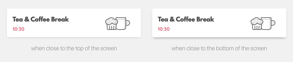
How is that possible? We definitely don’t change the elevation and outline based on the y-position of an item (we could, but it’s really not a good idea as it requires recalculating outlines on each scroll event).
You’ll remember I mentioned earlier how there are two shadows in the Material Design environment, one which sits above the top of the screen, and one that sits directly above the centre. Well, the top light — that is the key light — is casting a longer shadow when an item gets farther away from it. This is actually something that is always true in Android, you just don’t notice it as much in normal circumstances. The Squanchy style makes it more obvious though, and you can even exaggerate it further by using a higher elevation value:
One last thing before you go
Lastly, remember that Outlines aren’t just used for shadows, but by default they define the clipping of the view too! If you have a weird outline and don’t want it to influence the drawing of your actual view, you’ll want to call setClipToOutline(false) on it to avoid nasty surprises.
This is only important when the Outline you provide has canClip() returning true, which is the case when the outline is a rectangle, a rounded rectangle, or a circle. Non-round ovals, and arbitrary paths, are not able to provide clipping, so setClipToOutline() has no effect in those cases.
Fun fact: rectangles and circles are all internally represented as special cases of rounded rectangles. A rectangle is a rounded rectangle with a corner radius of zero, and a circle is a rounded rectangle whose corner radius is equal to half the circle height/width.
If you want to read some more on the topic, the Android Developers website has a page on Defining shadows and clipping views, that goes through the same topics with code examples, and links to some more javadocs.
To play around with elevations on your own Android device, I have cooked up a simple playground app:
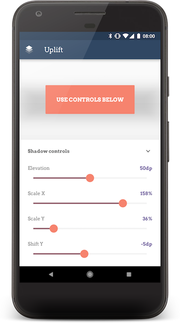

The code for the playground app is open source on GitHub.