


I’ve been studying the official Material Design specs for the Navigation Drawer, and I found out they are nice but a bit confusing, when it comes down to the actual width specs. So here’s what I found to be working nicely and pretty much matches Google’s best implementation, GMail for Android. tl;dr version is, as always, in the last section.
It’s really important to note that this post is based purely on real-life examples observation, common sense and best guessing of what the Material Design specs imply but don’t really specify. Also of note, the Navigation Drawer in Material Design lingo is called Side Nav Drawer. If it’s pinned to the screen (always visible) then it’s called Side Nav Panel.
We’re also only going to look at navigation drawers, not at secondary drawers that might appear in the apps (such as the notifications drawer in Google+).
The Google Material Design specs for Side Nav say this:
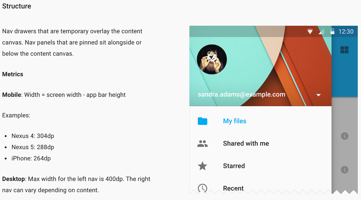
So, on mobile, you’re supposed to have a nav drawer that is always:
[width in dp] = [screen width in dp] - [app bar height in dp]And on desktop? Well…
[width in dp] = Math.min(400 dp, ???)You just know it’s got to be narrower than 400 dp.
The dark side of the specs
There are a few things that aren’t clear in the specs as they are now. I’m confident they’ll get updated and improved over time, but at their current status, they lack some significant infos.
Math is relative
The Nexus 5 screen is a nice 640 x 360 dp (xxhdpi), and an app bar on it is 56 dp tall. So the nav drawer should be:
[width in dp] = 360dp — 56dp = 304dpA Nexus 4 sports a 640 x 384 dp (xhdpi) screen instead. Same 56dp app bar height. Its nav drawer?
[width in dp] = 384dp — 56dp = 328dpSo, how did the Google designers come up with 288dp and 304dp widths, respectively? I have no idea.
Google apps, on the other hand, seem to agree with my maths. Oh, and you know what the funniest thing is in all this? The iPhone (which has different screen heights, but a constant 320 dp width) is marked correctly as having a 264dp nav drawer.
Landscape, who?
Judging from the specs, mobile devices in landscape should show a nav drawer that takes the full screen width, minus the app bar height (48dp for phones, 64dp for tablets and computers). This is though not the case; Google’s apps limit their nav drawer width to a fixed value.
Can you guess what that value is? The same 400dp as computers, you say? Nope.
That’s actually the same width that the drawer has in portrait orientation. So as it turns out, the (seemingly) correct formula for mobile is rather:
[width in dp] = [smallest width in dp] - [app bar height in dp]Where smallest width has the same meaning it has for the -swXXXdp resource qualifier: the size of the smallest screen side (i.e., the side that is the width in portrait mode).
Tablets, who?
Tablets aren’t really considered in the specs for Side Nav. You either have a mobile or a desktop approach. Tablets are mobile devices, so this would make you think mobile rules apply directly to tablets as well. At the same time, tablet layouts usually resemble computer layouts more than they resemble phone layouts, at least in landscape.
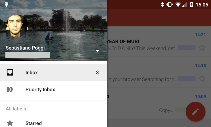
The GMail behaviour on tablets is actually different from both.

As you can see, GMail uses a pinned nav pane that has a pretty unique “collapsed” state, and can be expanded. Can you guess how wide it is when it’s expanded? Turns out, it’s exactly 288dp.
Is this always the case, though?
As you might have expected, that not being a standard pattern, that nav drawer is not of a standard size. Is there even such thing as a standard width, though?
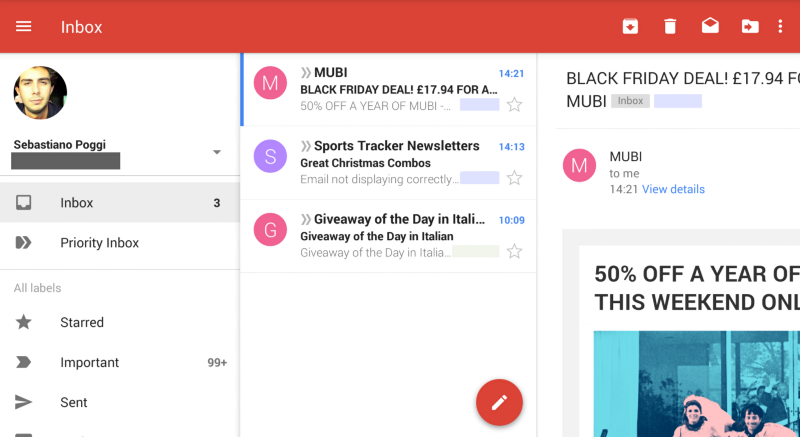
Take the Inbox, Maps and Google Play apps; they have a 320dp drawer, both in portrait and landscape. Google Calendar and Google Drive clock in at 300dp, on the same device. So it looks like there is no silver bullet here.
Other guidelines
After publishing the article, Dave Smith pointed out on my G+ post a couple more places where guidelines can be found.
The Patterns section of the specs
The first one is the page about the Navigation Drawer in the Patterns section of the specs. That page instruct us to use the same formula that is in the Layout section:
The width of the side nav is equal to the width of the screen minus the height of the action bar
BUT it goes on saying:
The maximum width of the nav drawer is 5 times the standard increment (56dp on mobile and 64dp on tablet).
This means that the navigation drawer should never be wider than 280dp on a phone (wat) and 320dp on a tablet (this is new, but is coherent with all Google apps).
The Android Developers blog
On the excellent post by Roman Nurik on the Android Developers blog, aptly titled Material Design on Android Checklist, you find this rule for sizing the nav drawer:
The drawer is a standard width: No wider than 320dp on phones and 400dp on tablets, but no narrower than the screen width minus the standard toolbar height (360dp - 56dp = 304dp on the Nexus 5)
[emphasis mine]
So it looks that the formula given in the specs is for the minimum width of the navigation drawer, and that there are actually some maximum widths for phones and tablets.
Note that, by these rules, on the Nexus 4 (384dp width) the minimum width is 384dp - 56dp = 328dp, which is more than the maximum width allowed on phones (320dp). On tablets it’s even worse.
Takeaways
Your nav bar should then be, according to what we’ve seen so far:
- narrower than 400dp (on tablets) or 320dp (on phones)
- having the same width on both portrait and landscape
- on phones, at least as wide as the screen smallest width, minus the app bar height
- on tablets, in theory at least as wide as the screen smallest width, minus the app bar height (e.g., 536dp on a 600dp 7" tablet, and 656dp on a 720dp 10" tablet). In practice, ranging anywhere between 300 and 320dp (which is pretty much the same size as it is on phones)
- on desktop, of any size up to 400dp
You’ll have noticed those rules do contradict themselves. Since there is no clear outcome, and since you probably want an easy answer, here’s the rule of thumb I’m settling on:
You can basically always use 304dp on -sw360dp and 320dp on -sw384dp, and roll with it
Thanks to Ben, Mark, David and Dave.