

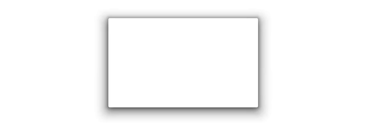
In the first part of this article we saw the new APIs introduced in Android Pie that allow us to have coloured elevation shadows. Our ambition had been crushed by the cruel design of elevation shadows APIs, which impose abysmal values for the alphas, thus making even the most lively shadow a pale disappointment.

Is that all there is to it? Turns out, no: I figured out a way around it.
Lateral thinking
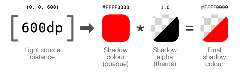
It turns out that, while the ambientShadowAlpha and spotShadowAlpha values are built into a theme at build time and cannot be changed at runtime, we do have full control over the values we pass to setOutlineAmbientShadowColor and setOutlineSpotShadowColor. Those are full ARGB colours, so if only we could get rid of the additional factor coming in from ambientShadowAlpha and spotShadowAlpha, we could fully control the shadows!
Although there’s no Java/Kotlin API to change them, those are still attributes we can set on the theme, and they act as a multiplication factor. What we want is to set the values to 1.0 so that the only actual factor left — besides the light source which is fixed and does not influence the shadows’ colour much — is the alpha channel on the outline shadow colours we set. Bingo!
We just need a couple other tricks to avoid breaking shadows for pre-Pie devices; in particular, we need a “normal” base theme that doesn’t have any overrides for the shadow alphas (which are available since Lollipop), and then override the alpha values for API 28+, setting them to 1.0.
Lastly, we set a default shadow colour for API 28+ that has the default alpha values premultiplied in. This way all the shadow will still look like they normally would, but we can still override the colour, and alpha, where we want.
<!-- res/values/themes.xml -->
<resources>

  <style name="Theme.Uplift.Base" parent="Theme.AppCompat.Light.NoActionBar">
    <!-- ... -->
  </style>

  <style name="Theme.Uplift" parent="Theme.Uplift.Base" />

</resources>
<!-- res/values-v28/themes.xml -->
<resources>
<style name="Theme.Uplift" parent="Theme.Uplift.Base">
<item name="android:ambientShadowAlpha">1</item>
<item name="android:outlineAmbientShadowColor">@color/defaultOutlineAmbientShadowColor</item>
<item name="android:spotShadowAlpha">1</item>
<item name="android:outlineSpotShadowColor">@color/defaultOutlineSpotShadowColor</item>
</style>
</resources><!-- res/values-v28/colors.xml -->
<resources>
<color name="defaultOutlineAmbientShadowColor">#0A000000</color>
<color name="defaultOutlineSpotShadowColor">#30000000</color>
</resources>Colours for everyone
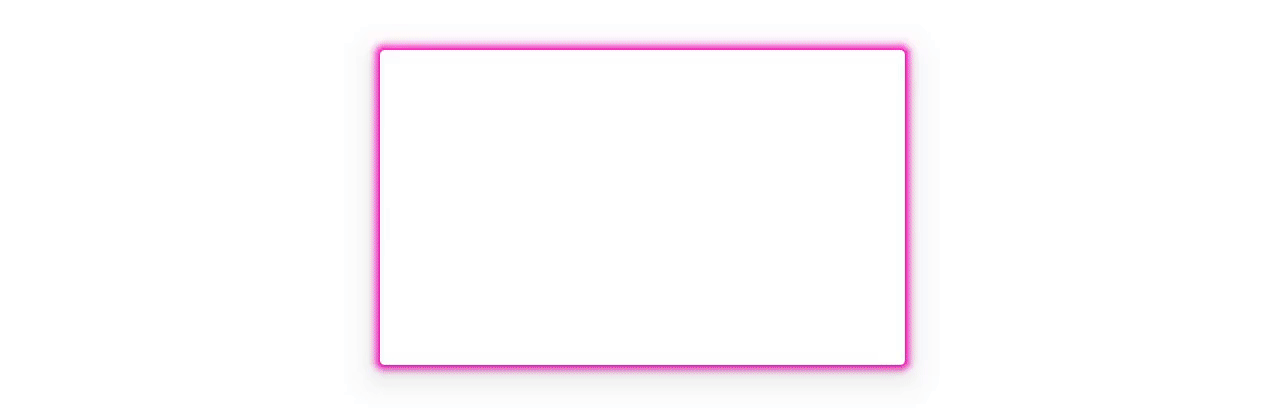
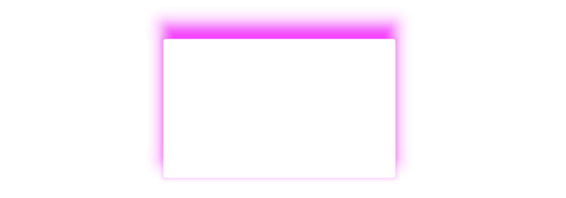
We can now have multicoloured shadows, if we so wish, that actually look coloured! There are interesting potential applications for these hacks, such as having some shadows in the app being used to highlight elements, or to obtain particular effects; for example, Mike Wolfson suggested matching an image’s extracted palette colours with the elevation shadow.
But we can also get crazy and crank up the tackiness to 11! Here we loop the shadow’s hue values with only a fully opaque ambient shadow:
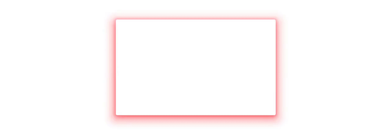
And this is how it looks with 20% alpha for the ambient shadow and 78% for the spot shadow:
Note how you can now control the opacity of the shadows at runtime too, by just varying the alpha component of the shadow colours, and the translationZ:
Don’t try this at home
We’ve said that the light source position for the spot light source is fixed at (0dp, 0dp, 600dp), and the light has an 800dp radius, but can that be changed? Not that there is literally any good reason to do it… but just because it’s fun. You should really never, ever do this.
The values encoding the position and size of the light are defined in AOSP by three resources (there is no hardcoded x position for the light, it is centered on the screen):
<!-- Excerpt from AOSP's dimens.xml -->
<resources>

    <!-- Lighting and shadow properties -->
    <dimen name="light_y">0dp</dimen>
    <dimen name="light_z">600dp</dimen>
    <dimen name="light_radius">800dp</dimen>

</resources>
<!-- Excerpt from AOSP's themes.xml -->
<resources>
<style name="Theme">
<!-- Lighting and shadow properties -->
<item name="lightY">@dimen/light_y</item>
<item name="lightZ">@dimen/light_z</item>
<item name="lightRadius">@dimen/light_radius</item>
</style>
</resources>This means we can theoretically adopt a similar approach as for the alpha, and modify the theme we’re using to override any of those values… except it is not that simple. The lightY, lightZ and lightRadius attributes are private, which means that just overriding them in the theme like this:
<!-- /res/values-v28/themes.xml -->
<resources>

  <style name="Theme.Uplift.Hack" parent="Theme.Uplift">
    <!-- ... -->
    <item name="android:lightY">1000dp</item>
  </style>

</resources>
You will get a build error:
FAILURE: Build failed with an exception.

* What went wrong:
Execution failed for task ':app:processDebugResources'.
> Android resource linking failed
  ~/.gradle/caches/transforms-1/files-1.1/appcompat-1.0.0.aar/bce56009c441dccbe9afec2c071dd480/res/values/values.xml: AAPT: error: style attribute 'android:attr/lightY' is private.

  error: failed linking references.
Luckily enough, you can bypass the AAPT private resource validation by prepending an * to the name of the attribute:
<!-- /res/values-v28/themes.xml -->
<resources>

  <style name="Theme.Uplift.Hack" parent="Theme.Uplift">
    <!-- ... -->
    <item name="*android:lightY">1000dp</item>
  </style>

</resources>
And you’ll end up with an atrocity like this:
No, it’s not upside down. It’s just that the light source is now positioned 1000dp down the Y axis, which goes towards the bottom of the screen. So yeah, we proved it can be done (for science! 👨🔬), but you should really really — really! — never do it.