
I recently wrote an article about elevation in Android, showing how you can hack around framework restrictions to obtain elevation shadows that are different than what the Material Design guidelines mandate.
Since then, there’s been a few interesting developments on the topic, and this follow-up article will cover them. Come for the shadows, stay for the code!
As a side note, I have recently pushed a major update to the app that accompanies last year’s blog post. Uplift has now hit version 3, and there’s a lot more than meets the eye in that release.


As usual, you can download Uplift from the Play Store, and the full source code is available on GitHub.
Coloured shadows
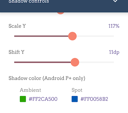
The biggest change in Uplift 3 is the new controls at the bottom of the shadow settings panel that allow you to tint the elevation shadows.
This new feature in the app will only work on Android P and later, because it relies on two new APIs introduced in Android Pie.
The new APIs are setOutlineAmbientShadowColor and setOutlinePostShadowColor and their attribute counterparts, outlineAmbientShadowColor and outlineSpotShadowColor. These two APIs finally allow us to control the shadow colour for views with elevation. But why two distinct values? And what do ambient and spot mean?
If you recall, in the previous article we had this image:
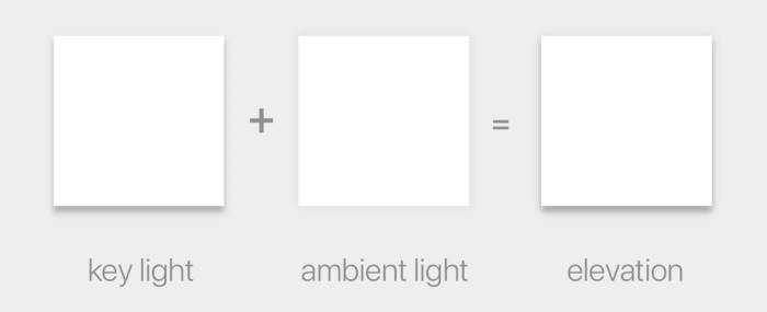
As you can see, the elevation shadow is really two shadows combined together. One is generated by a virtual spotlight positioned above the top of the screen, and is referred to in the above image as the key light; the other by ambient lighting. The former is the source of the key light and casts a harder shadow that is slightly offset towards the bottom of the screen, and the latter casts a subtle, soft shadow that surrounds the objects and is aligned to it.
The two APIs are each controlling the colour of one of the two shadows that compose the elevation shadow. It allows you to have one but not the other by simply setting the colour to fully transparent. I cannot think of a reason why you would ever want to have them in different colours, or only one of the two, though.
Opacity woes
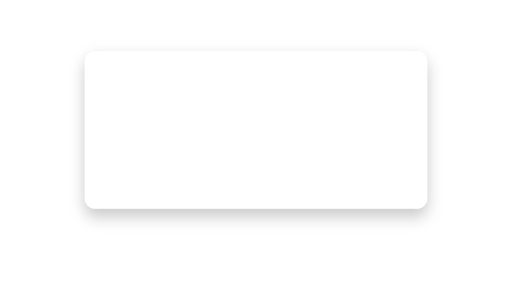
You will notice, though, that setting a fully opaque colour for a shadow does not make your shadow very opaque. This is a fully opaque black shadow (#FF000000), and yet it looks very soft:
The documentation explains why this is:
The opacity of the final spot shadow is a function of the shadow caster height, the alpha channel of theoutlineSpotShadowColor(typically opaque), and theR.attr.spotShadowAlphatheme attribute.
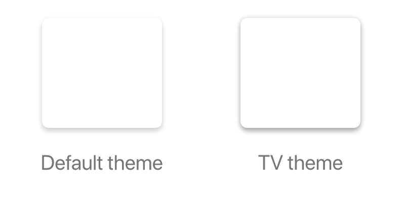
The same goes for outlineAmbientShadowColor and `ambientShadowAlpha`. The values in the Material and AppCompat themes as of API 28 are 0.039 (3.9%) for ambientShadowAlpha and 0.19 (19%) for spotShadowAlpha. The only exception is that TV devices have higher values, set to 0.15 (15%) and 0.3 (30%) respectively:
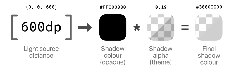
The cold numbers
If we look at the colours we are using, it’s easy to see how things get very subtle even with fully black shadow colours. Firstly, the documentation mentions that the shadow casters influence the shadow opacity: those casters are currently fixed. The ambient shadow is cast by an omnidirectional light source, which has no actual position in space, while the spot shadow is cast by a light source positioned at (0dp, 0dp, 600dp) with an 800dp radius.
The light source position is not something we really want to exert any control upon, and we thus don’t consider it in our calculations except to acknowledge that it has an influence.
Then there is the aforementioned alpha factor, which is determined by ambientShadowAlpha and spotShadowAlpha, both determined by the Material theme and without a way to change them at runtime. This is the real reason why our shadows look so subtle. In the example of the spot shadow:
So it looks like we’re destined to have very subtle and muted shadows: we can’t control the light source position, and we’re constrained to having at most 3.9% or 19% opacity (for ambient and spot respectively). Look at these fully saturated elevation shadows as rendered by Android P:
It’s just disappointing. This new API seems designed to prevent us from going overboard with our crazy shadow antics, but what if we could get the bolder, colourful shadows we crave?

In the next part of the article we’ll explore some… creative solutions to get the shadow tinted the way we want, bypassing some of the limitations the OS puts on us.